Highly qualified professionals united by 1 target: conducting analysis of the current Forex conditions

FXPrestige has been enlarging its staff with the goal to provide its customers with comprehensive and highly reliable analytics.

Awesome customers support services by dedicated professionals

- Dedicated Support Areas - Comprehensive Contacts Information - Credible Introducing Offices - Callback Service - Journalist Inquiries -

FXPrestige - Future Leader In Online Trading!

We open new HORIZONS for opportunities...

Forex learning course for beginners by FXPrestige

Exclusive distance course, written by the company's traders and analysts, based on the most popular and user-friendly MetaTrader 4 platform.

Today, FXPrestige services are of great interest for thousands of traders and partners all over the world

Offering the most generous and rewarding affiliation and partnership programme globally.

Showing posts with label Education. Show all posts

Friday, 2 September 2016

Simple US NFP Forex Strategy

Featured Article

This simple non-farm payroll forex strategy allows you capitalize on the most volatile moments in the forex market. On the first Friday (sometimes the second Friday) of each month at 8:30 AM EST  the non-farm payroll (NFP) data is released. This is the most trusted source traders, investors and institutions use to track the US employment situation, which sheds light on the strength of the economy and potentially inflation. The report causes a massive reshuffling in positions, and seeing a 100 pip movement in the GBP/USD in the moments following the announcement is not uncommon.
On a typical Friday, the GBP/USD will move approximately 100 pips (10-week average as of Oct. 22, 2013). On a non-farm payroll release day, intraday movement can be much larger. For current weekday and hourly volatility see the Daily Forex Statistics page.

Non-farm Payroll Forex Strategy Setup

The strategy uses the GBP/USD and a 15-minute chart. A 15-minute chart allows the initial volatility to subside, but still allows us to capture a large potential move once the market participants make a more rational decision about whether they want to buy or sell based on the news. This is the trend this non-farm payroll forex strategy attempts to capture…the rational trend which follows the initial surge.
The EUR/USD could also be used, but since the GBP/USD usually has a bigger daily range than the EUR/USD it provides great opportunity. A 5-minute chart can also be used, but is prone to more false signals.

Non-farm Payroll Forex Strategy Rules

1. Do nothing for the first 15 minutes after the NFP announcement. A wide-ranging price bar will occur between 8:30 to 8:45 AM EST. This bar is of no concern.
2. Wait for an inside bar. An inside bar is a 15-minute price bar where the high and low are completely inside a prior bar range.
Figure 1. Wide Ranging and Inside Bars for Non-Farm Payroll Forex Strategy – 15-Minute Chart
Figure 1 shows a wide-ranging bar followed by an inside bar. The inside bar doesn’t always immediately follow a wide ranging bar. Depending on volatility and the strength of the initial push, we may need to wait a couple bars in order for an inside bar to occur. The inside bar doesn’t need to be inside the wide ranging bar either, we just need a bar that is inside another bar. This shows us the market has calmed down, and is likely to soon choose its more rational direction.
3.  The high and low of the inside bar become your trade triggers. If the price rises above the high of the inside bar, buy. If the price drops below the low the inside bar, sell.
4. Place a 30 pip stop initially, or place it below the most recent low if you bought, or above the most recent high if you sold. But your stop should not exceed 30 pips.
Figure 2. Non-Farm Payroll Forex Strategy Entry and Stop Example – 15 Minute Chart
In this example, the initial inside bar which followed the wide ranging bar is used for the trade trigger. Following the initial inside bar, two more inside bars followed. This basically created a range, so in this case waiting for the breakout of that range was prudent. Either of these other inside bars could technically be used as trade triggers though.
The horizontal blue dotted lined shows the entry, which is set a pip or two above the inside bar high. The dotted line in the lower part of the screen marks the stop-loss order. Initially the stop loss is set to 30 pips, but in this case it was moved up to just below the recent lows, reducing the risk to 25 pips.
We do not need to wait for a bar to close in order to enter a trade. As soon as the high or low of the inside bar is pierced, take the trade.
5. Exit 4 hours after your entry. This is a timed exit. Once the trend begins it will often last for about 4 hours. If you enter at 9:15 AM, exit the trade at 1:15 PM EST. Exit at 2:00 PM EST even if it has not been 4 hours since your entry. By 2:00 PM other factors are likely to start affecting the pair, and most of the movement based on the NFP number will be exhausted.
6. Don’t take more than 2 trades. If you get stopped out on 2 trades, the movement is too choppy. Stash the strategy away until the next non-farm payroll number, or other high impact news release.
7. This step is optional, but you can implement some sort of trailing stop to avoid giving up your profit if the trend reverses while holding the position. As the trend progresses, move the stop to just below recent swing lows if you are long, or just below recent highs if you are short.
Figure 3 shows the whole GBPUSD trade for the  October 22 2013 Non-farm payroll release. In a rare event, the data was released on a Tuesday due to the US government shutdown on the Friday the data was supposed to be released. Ultimately the trade produced about a 54 pip profit at the 4-hour time target. Original risk was 25 pips, but could have been trailed up, locking in a profit, after the first consolidation. Sometimes wins will much bigger, and other times slightly smaller.
Figure 3. NFP Forex Strategy in GBPUSD with Entry Stop and Timed Target – 15-Minute Chart

Non-Farm Payroll Forex Strategy – Considerations and Pitfalls

Overall I have been using this strategy–or one very similar to it–for than 5 years, and find it to be a reliable strategy. It can experiences strings of losses though. The worst days are when 2 false signals occur in one day, which means 40 to 60 pips could be lost. This is rare, but can occur. Although, on any choppy day a trend following strategy is likely to experience more losses. Profits are usually much larger than losses on winning trades, which should more than offset losing trades.
If the GBP/USD doesn’t move much following the non-farm payroll announcement, then the news release is likely a “non-event” and the strategy should not be employed. Ideally we want to see a 50+ pip spike (up or down) following the announcement, which lets us know there is some reshuffling of positions and a trend is likely to ensue.
This strategy can be used on other major news releases, such as interest rate announcements, assuming there is a strong burst of activity following the announcement, and a valid trade signals occurs like in the example above.
As a final note, don’t take trades just before the announcement trying to predict which way the market will spike. Even if you guess right, you’re likely to experience extreme slippage, and therefore your risk is unknown. Better to wait for a valid trade signal like the one provided above, and trade the trend that happens after the spike.
This strategy is included in the The Forex Trading Strategies Guide for Day and Swing Traders eBook. Read the book for way more strategies and information you can use to conquer the forex market.
=================
Read the Original HERE

Monday, 15 August 2016

How to Use the Dollar Index for Forex Trading

FEATURED ARTICLE


I bet you’re wondering, “How do I use this USDX in my trading arsenal?”
Well, hold your trigger finger and you’ll soon find out! We all know that most of the widely traded currency pairs include the U.S. dollar. If you don’t know, some that include the U.S. dollar are EUR/USD, GBP/USD, USD/CHF, USD/JPY, and USD/CAD.
What does this mean? If you trade any of these pairs, the USDX can be the next best thing to sliced bread (or hamburger on a bun… or chocolate ice cream).
If you don’t, the USDX will still give you an idea of the relative strength of the U.S. dollar around the world. In fact, when the market outlook for the U.S. dollar is unclear, more often times than not, the USDX provides a better picture.
In the wide world of forex, the USDX can be used as an indicator of the U.S. dollar’s strength.
Because the USDX is comprised of more than 50% by the euro zone, EUR/USD is quite inversely related. Check it:

Next, take a look at a chart of EUR/USD.


It’s like a mirror image! If one goes up, the other most likely goes down. Will you look at that? It seems like the trend lines almost inversely match up perfectly. This could be a big help to those big on trading EUR/USD.
Some of our forex trading friends in the forums monitor the USDX as an indicator for EUR/USD. Hang out with them if you wanna learn more about using this index.
If the USDX makes significant movements, you can almost surely expect currency traders to react to the movement accordingly. Both the USDX and forex traders react to each other. Breakouts in spot USD pairs will almost certainly move the USDX in similar breakout fashion.
To sum it all up, forex traders use the USDX as a key indicator for the direction of the USD.
Always keep in mind the position of the USD in the pair you are trading.
For example, if the USDX is strengthening and rising, and you are trading EUR/USD, a strong USD will show a downtrend on the EUR/USD chart. If you are trading a pair in which the USD is the based currency, such as the USD/CHF, a rise in the USDX will most likely show a rise in USD/CHF charts like the one shown below.


Here are two little tips you should always remember:
If USD is the base currency (USD/XXX), then the USDX and the currency pair should move the same direction.
If USD is the quote currency (XXX/USD), then the USDX and the currency pair should move in opposite directions.
------------------------------------
Read the original HERE

Saturday, 30 July 2016

Track The Largest Traders With The COT Report

FEATURED ARTICLE


Talking Points:
  • What Is The Commitment of Traders Report?
  • Who Are the Players In The Report?
  • How to Read CoT for Directional Bias
What Is the Commitment of Traders Report?
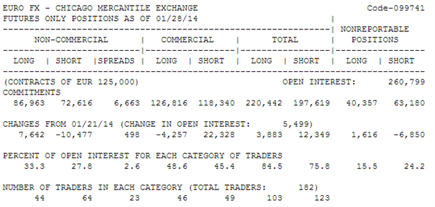
How would you like to know what the smartest guys and girls in the room are doing? Thanks to a requirement by the Commodity Futures Trading Commission, the largest futures traders in the world are required to report their positions which can easily be tracked due to the margin they must pay to hold their large positions which the CFTC has been publishing since 1962 and since 2000, every Friday at 3:30ET pm. This information can be of extreme help due to the people who come into the Futures market like hedge funds to make a return above their respective index or some of the largest companies in the world with real-time data of the health of the economy that come to the futures market to hedge their exposure to price fluctuations of raw materials that they use to make their product or preform their service.
Learn Forex: CoT Report for Euro FX (EURUSD) as of 01/28/2014
CoT_body_Picture_1.png, Track The Largest Traders With The Commitment of Traders (CoT) Report
It may be helpful to think of the CoT report as a sentiment indicator with a lot more depth than most indicators. The depth, of course, comes from the fact that the readings are based on the largest future traders and can help you see when large fortune-500 companies switch their outlook on something that you’re trading. In short, this report provides incredible levels of insider intelligence that you’d be hard-pressed to find in another avenue.
Who Are the Players In The Report?
Commercials – Using the futures market primarily for hedging unfavorable price swings to their daily operations. They likely have the best insight as to what the demand and future is for the market as a hole and have some of the deepest pockets. These players are also known as commercial hedgers.
Examples: Coca Cola in the Sugar Market or American Airlines in the Gasoline Market
Non-Commercials (Speculators / Funds) – Traders, whether hedge-funds are large individuals, who have no interest in taking delivery but are rather in the market for profit and meet reportable requirements of the CFTC.
Examples: Hedge Funds and large banks or large Commodity Trading Advisors (CTAs)
Nonreportable Positions – Long & Short open interest on positions that don’t meet reportable requirements, i.e. small traders.
Examples: This is the leveraged players without deep pockets and are shaken out on big moves, similar to the DailyFX SSI.
How to Read the CoT for Directional Bias?
Upon the first reading of the CoT, you may be confused how future positions in USD, JPY, GBP or EUR could be helpful for trading EURUD, USDJPY, or EURGBP. There is a lot to learn about the Commitment of Traders report but what’s often helpful is to find when there is a very strong divergence between large speculators and large commercials.
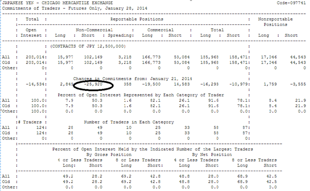
Learn Forex: Look to See What Hedge Funds Are Buying Selling
CoT_body_Picture_2.png, Track The Largest Traders With The Commitment of Traders (CoT) Report
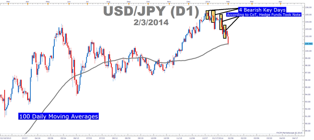
Learn Forex: Non-Commercials / Hedge Funds Sold USDJPY Longs & Charts Confirm This
CoT_body_Picture_3.png, Track The Largest Traders With The Commitment of Traders (CoT) Report
Presented by FXCM’s FXCM Trading Station 2.0
The first place to start with is a clean understanding of Net Positioning which is shown clearly on the reportsand the week over week differential of major market bias (circled above). It may be helpful to know that what you’re looking for isn’t as much the specific number but a clear sign in % of open interest or bias so that you see Non-Commercials / Funds flipping against the primary trend. Furthermore, when you see a key flip in sentiment of non-commercials / funds who are in it for the money and not to be hedged like commercials, and there is a confirmation on the charts that a trend is exhausting, you are likely trading in the direction of the big kids.
As you can see from the last report in January, the number of funds off-loading the JPY shorts increased dramatically from the week prior. When you see this type of shift from major funds, you can look for other signs that show the prior trend is losing steam and that maybe you should exit the trade too. The chart above of USDJPY notes that there have been 4 bearish key days on USDJPY since the start of 2014 at the same time non-commercials have unloaded their USDJPY longs / JPY shorts giving credence that this move down may have more to go.
Another excellent tool, is the Commitment of Traders Analysis from DailyFX. This weekly report provides analysis of the CFTC report, showing the positioning of Forex futures trades with a synopsis of the key flips in positioning. This report also helps traders by providing 52-week percentiles of major moves so you can see if we’re currently at annual bullish / bearish extremes so that you should be tightening stops or looking for price action to confirm the funds are selling out so that you can follow.
Bottom Line: Look for Chart Validation of what the Non-Commercial Are Doing. When you have a large percentage (greater than 10%) of non-commercials flipping their bias, it’s time for you to take note. Lastly, if you want to really juice up your understanding of market sentiment, you can get a better feel for how a sample group of non-reportables or smaller traders like FXCM customers are positioned in OTC FX via the DailyFX Speculative Sentiment Index which is updated twice a day.

_________________________________________
Read the original article HERE

Monday, 18 July 2016

The Science of Trading: Supply and Demand

FEATURED ARTICLE

How many times have you heard someone say "trading is an art, not a science"?
I have heard that for years and years and I have to say, it is probably the most ridiculous statement I have heard when it comes to trading and as we all know, there are some pretty ridiculous statements in the trading world.

IT'S A NUMBERS GAME

There is absolutely nothing artistic about trading at all. This is 100% a numbers game. How much willing demand and supply at each price level is what determines price movement. It's the buy orders versus the sell orders and again, it all comes down to the numbers on both sides of that equation and nothing else. To think Picasso or Van Gough should be brought into this discussion is rather amusing if you think about it.

SUPPLY AND DEMAND

I began my career many years ago on the floor of the Chicago Mercantile Exchange (CME), facilitating institution and bank order flow. What I realized very quickly was the fact that the movement of price in any and all markets is a function of supply and demand.
Therefore, trading opportunity exists at price levels where this simple and straight forward equation is out of balance. You simply buy where the major buy orders are and sell where the major sell orders are.
After spending time on the trading floor and then looking at price charts online, I taught myself to identify these orders on a price chart, the picture that represents a major supply and demand imbalance. To make my point, let me share a very recent trade I setup for my students in our live trading room.
THE SETUP
While the strategy I am about to lay out for you works the same in any time frame and market, let's focus on a short term trade for our example so we can see the entire strategy play out on one clear chart. About an hour before the stock market opened, I was sharing a chart of the NASDAQ with my students.
Notice the area shaded yellow, with the black lines extending right. According to supply and demand, that area shaded yellow was a key supply level. Meaning, institutions/banks had large orders to sell at that level, there was a significant supply and demand imbalance at that level.
We know this because price could not remain at that level and declined in strong fashion after a very short period of time. Think about it, if that statement was not true and supply and demand were in balance at that level, price would have remained at that level but, it couldn't because supply and demand were very much "out of balance."

THE CHART QUANTIFIES SUPPLY AND DEMAND

When I was at the CME and had the orders in front of me, I knew exactly what the supply and demandequation was. Most people think that because today, we look at price charts and don't see the orders, we can't truly quantify supply and demand and perhaps that's where some of the "artsy" talk comes from but... think again... I would argue that we can quantify supply and demand by looking at a price chart.
In fact, I would argue that it's easier than being on the floor of the exchange because the price charts represent all buyers and sellers. On the trading floor, you can only see what is in front of and around you. To quantify supply and demand on a price chart, I use what I call "odds enhancers." While there are a few of them, let me go over two to help get you thinking in the right direction. I mentioned price spent very little time at that supply level above, this is a key point.

ODDS ENHANCER #1

The stronger the move in price away from a price level, the more out of balance supply and demand is at the level.
Price can move away from an area in one of three ways. It can be gradual, strong, or gap. The gap represents the strongest imblance. In our example here, notice the initial move away from the supply level was strong suggesting institutions were selling at that level.

ODDS ENHANCER #2

The less time price spends at a level, the more out of balance supply and demand is at the level.
Notice on that same chart, there was very little trading activity in the area shaded yellow. Trading books tell us when looking for key support and resistance levels, look for areas on the chart where there was lots of trading activity, many candles on the screen, above average volume, and so on... If you think the simple logic through, I think you will find the opposite to be true. At price levels in any market wheresupply and demand is most out of balance, you are going to get very few transactions (trades), not many. Therefore, that picture on a chart is going to be few candles on the screen, not many like most trading books say and this was the case in our trading opportunity above.

THE RESULT
As you can see on the chart above, a bit into our trading session, the NASDAQ rallied up to the supply level, offering us an opportunity to sell short with a 2 point stop and a 14 point profit target. The 14 point profit target comes from that circled area on the chart. Notice there is no demand in that circled area. This means that price should have a very easy time falling through that area once price turned at our supply level.
Lastly, when price reached supply, we always want to know who we are selling to. We need to make sure we are selling to a novice retail trader. The way we answer this questions is this: Is the buyer in this case who is buying from us making the same two mistakes every novice trader makes? Specifically, is the buyer we are selling to buying after a rally in price (mistake number one) and into a price level where supply exceeds demand (mistake number two). If the answers are yes and the risk reward meets the minimum criteria we are looking for, we take the trade like a robot.

PLAN AHEAD

The mathematical equation we mapped out in ADVANCE played out as we thought and our profit target was achieved. If you think art had anything to do with this, I have a great piece of dessert property in Nevada I will sell you for half price. It's really special sand that cleans your feet when you walk on it. It's normally $10,000 a square foot but I will give it to you for $5,000 so hurry up. I'm kidding of course but you see when I was on the institution side of the trading business, it was very clear how and why price moved in any market.

BIDS AND OFFERS

At the CME, they didn't have Monet's or Picasso's on the wall, they had bids and offers. If I wanted to see art, I would walk down Monroe Street to Michigan Avenue and go to the Art Institute.
Goldman Sachs doesn't start out each trading day with a company meeting to discuss artistic opportunities in the market; every single decision is based on inventory, order flow, risk/reward, and so on. The key is to stick to the basic principles of how you make money buying and selling anything as that is exactly how you achieve profits speculating in the financial markets.
=============
Original author: Sam Seiden
Read the original article HERE

Thursday, 14 July 2016

Forex Glossary and Terminology


 <click above pic for downloadable access>

Credit to
Investopedia.com
Forex-Trader.com